Form
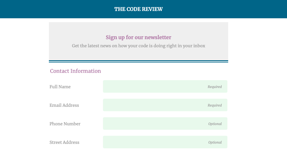
Forms come in all shapes and sizes and encompass many types of data input fields. This form is an example of a responsive, mobile-friendly registration page using a wide variety of HTML form input types and attributes.
About the Project
Accessing input types and attributes, I was able to change the design of the form using CSS. Later, media queries were introduced allowing the site to become responsive for mobile, tablet, and desktop sizes.
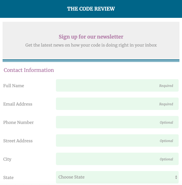
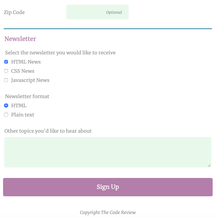
This form comprises:
- text input
- email input
- telephone input
- select menu
- checkboxes
- radio buttons
- textfield
- submit button
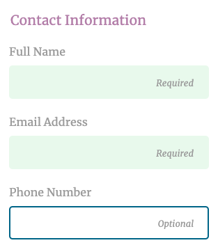
Placeholder text informs the user if information is required or optional.
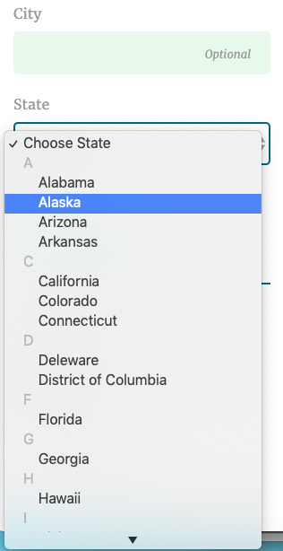
Focus states also include a transition upon focus so the visual switch is not jarring.
What I Learned
Changing the look of a form is slightly different from changing plain HTML in CSS. I learned to access each part of the form with input types (input[type=text], input[type=email], etc.) rather than classes. This form in general had many examples of input types and selectors that made up its whole.
I also learned about the focus state and how, with simple CSS, I could change its appearance and transition properties giving me greater control to pass design properties to user interactions.
Skills
- HTML
- CSS
- Focus state
- Mobile-first responsive design