Impact Report 2014

The Impact Report 2014 highlights Jobs for the Future’s social and economic accomplishments across the nation in 2014. It charts the progress of young people who are on the path to college success, adults who earn a labour market credential, and adults who go on to a family-supporting career.
About the Project
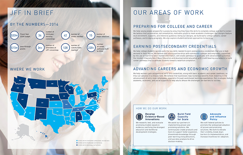
The impact report is united through the use of consistent fonts and colours even though it is divided into three sections: quick facts, areas of work, and the strategic plan. In the quick facts section statistics are separated into individual circles for easy perusing, the map is broken down into three colour groups for quick understanding, and the ways in which JFF works are represented by icons that are used again at the end of the publication.

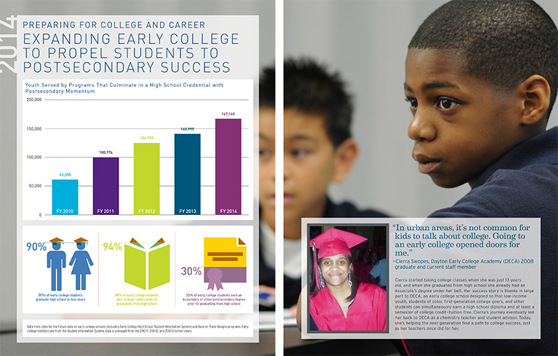
Each area of work has a dedicated spread that includes a graph showcasing the growth of the programs, mini infographics to easily disseminate quick information, and a profile highlighting a success story. Simple, bright coloured graphics standout from the page making the data friendlier to read and easier to digest. Each graphic is designed in a way that they can be removed from context and combined into other presentations and reports, yet still retain their meaning.

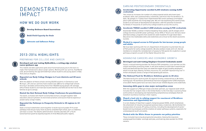
The end of the publication brings back the “How We Do Our Work” icons that were introduced in the beginning. They are used to break down the 2013–2014 highlights into how they were achieved without being intrusive to the body content. Beyond this publication, the icons have been carried over into presentations that discuss JFF’s work.

What I Learned
This impact report started as a yearly report. Data was constantly updated and added making the report obsolete by the time it was finished being written. After years of trying to get it out into the world, it was finally decided to make it into an impact report that would not report on the past year but instead focus on the impact the initiatives have made over many years.
Since it covered multiple years, large amounts of data were being compiled and needed to be easily read while keeping text at a minimum. This data was turned into different charts and graphics that would also serve as promotional information for Jobs for the Future, not only in this report but, in other reports and PowerPoints given at meetings and conferences.
I learned that people respond really well to infographics. They are fun ways to disseminate data to people without using bar graph after bar graph. Breaking the data up into multiple infographics, I designed the charts and graphics to be different on each page of the report to keep the visuals interesting. Later, JFF was able to reuse each individual infographic for other purposes. They were all designed with JFF’s branded colour system allowing them to be used and shared everywhere and still be in branding guidelines no matter who used them.
Skills
- Organization
- Design
- Illustration
- Streamline information
- Adhering to branding